5 Graphics with ggplot2
Graphics are very important for data analysis. On the one hand, we can use it for exploratory data analysis to discover any hidden relationships or simply to get an overview. On the other hand, we need graphics to present results and communicate them to others.
In contrast, ggplot2 is based on an intuitive syntax, the so-called [Grammar of graphics] (http://vita.had.co.nz/papers/layered-grammar.pdf). Once you get used to it, you can create very complex graphics with an elegant and consistent “grammar”. ggplot2 is designed to work with tidy data, i.e. we need data in long format. Graphics are always created according to the same principle:
Step 1: We start with a data set and create a plot object using the function ggplot().
Step 2: We define so-called “aesthetic mappings”, i.e. we determine which variables should be displayed on the X and Y axes and which variables are used to group the data. The function we use for this is called aes().
Step 3: We add one or more “layers” to the plot. These layers define how something should be displayed, e.g. as a line or as a histogram. These functions begin with the prefix geom_, e.g. geom_line().
To use ggplot2 we need an additional operator: +. You already know this as a mathematical operator, but in this context, the use of + means that we combine individual elements of a plot object.
After this somewhat abstract introduction, we illustrate these steps with a practical example.
At the end of the last chapter, we examined the relationship between psychological stress and gender. Now we load the data set again:
library(dplyr)
library(tidyr)
library(stringr)
library(haven)

westost <- read_sav("data/Beispieldatensatz.sav")
and create a data set containing only the variables ID,gender and stress_psych.
stress_psych <- westost %>%
    select(ID, geschlecht, stress_psych) %>%
    mutate(geschlecht = factor(geschlecht),
           ID = factor(ID)) %>%
    drop_na()
stress_psych
#> # A tibble: 284 x 3
#>   ID    geschlecht stress_psych
#>   <fct> <fct>             <dbl>
#> 1 2     0                  3.50
#> 2 14    0                  1.00
#> 3 15    0                  2.50
#> 4 17    0                  1.67
#> 5 18    0                  2.50
#> 6 19    0                  6.83
#> # ... with 278 more rows
In this data set we have a numeric variable, stress_psych and a grouping variable gender. Our question was whether the variable stress_psych is related to the grouping variable gender. We could graphically illustrate this relationship in various ways: with dots, with a box plot or with a violin plot. These three methods are geoms in the language of ggplot2 and can be used as follows: geom_point (), geom_boxplot() or geom_violin(). In addition, there is a function geom_jitter() that spatially jitters the data points (as an alternative to displaying data points with the same value on top of each other).
We can load the ggplot2 package individually or as part of the tidyverse:
library(ggplot2)

# or

library(tidyverse)
5.1 Step 1: Creating a plot object
We start with a data set and create a plot object with the function ggplot (). This function has a data frame as the first argument. This means that we can use the pipe operator:
We thus have two options. We prefer the pipe notation here, but it is also possible to specify the data frame as an argument within the function. Furthermore, we assign the object to a variable and call it p.
# 1st option
p <- ggplot(data = stress_psych)

# 2nd option
p <- stress_psych %>%
    ggplot()
5.2 Step 2: Aesthetic mappings
With the second argument mapping we now define the “aesthetic mappings”. These determine how the variables are used to represent the data and are defined using the aes() function. We want to represent the grouping variable gender on the X-axis and stress_psych should be displayed on the Y-axis. In addition, aes() can have additional arguments: fill,color, shape,linetype, group. These are used to assign different colors, shapes, lines, etc. to the levels of grouping variables.
In this example, we have the grouping variable gender and we want the two levels of gender to have different colors and to be filled in with different colors.
color is an attribute of lines or points, fill is an attribute of areas.
If we define the “aesthetic mappings” within the function ggplot(), they apply to all “layers”, i.e. for all elements of the plot. We could also define these mappings separately for each “layer”.
p <- stress_psych %>%
    ggplot(mapping = aes(x = geschlecht,
                         y = stress_psych,
                         color = geschlecht,
                         fill = geschlecht))
p is now an ‘empty’ plot object. We can look at it, but nothing is displayed yet, as it does not yet contain “layers”. A ggplot2 object is displayed by having the object sent to the console, either with or without print ().
p

# or

print(p)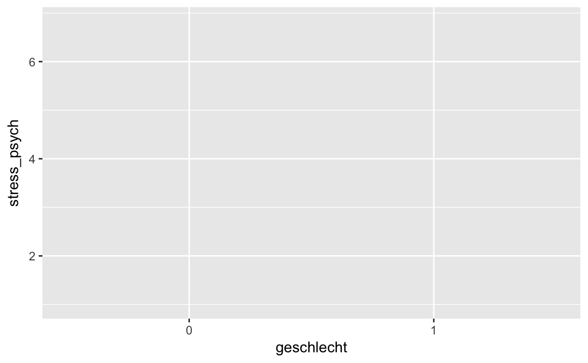

We can see that ggplot2 has already labeled the axes for us using the variable names.
5.3 Step 3: Add geoms
Using the geom_ functions we can now add “layers” to the plot object p. The syntax works like this: We “add” (+) a geom to the plot object p: p + geom_.
5.3.1 Scatter plot
We first try to represent the observations as points:
# the geom_point() function has a size argument
p + geom_point(size = 3)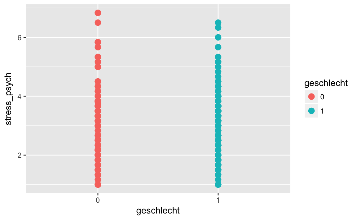
The points are now displayed in different colors, but within a gender points may be plotted on top of each other if they have the same value (overplotting). In this case, there is the function geom_jitter (), which draws points with a jittering side by side:
p + geom_jitter()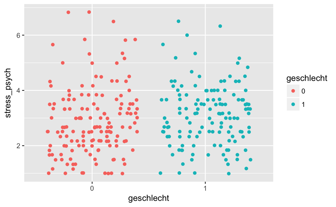
geom_jitter () has an argument width, with which we can define how widely the points are being jittered.
p + geom_jitter(width = 0.2)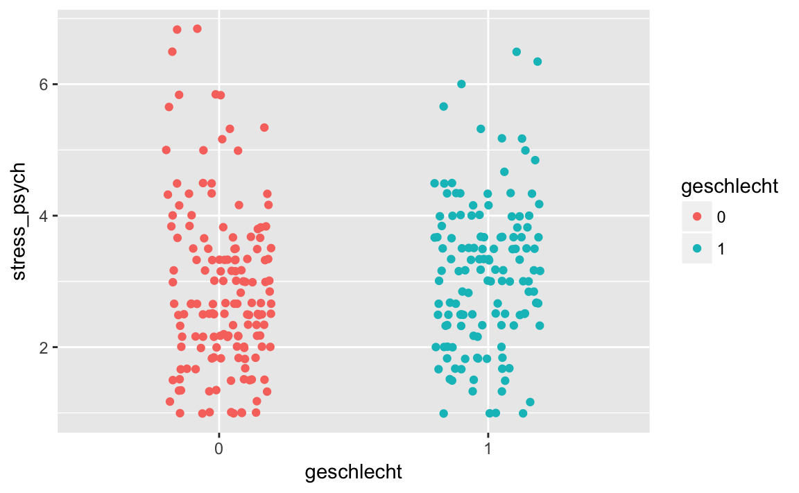
geom_jitter() has further arguments: size determines the diameter of the points, alpha determines their transparency.
p + geom_jitter(width = 0.2, size = 4, alpha = 0.6)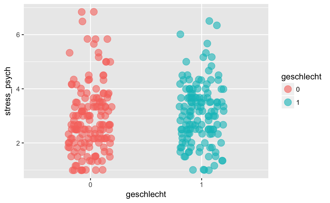
5.3.2 Grafically displaying a distribution
Another possibility is to represent the central tendency and dispersion of the data with a box plot or a violin plot.
p + geom_boxplot()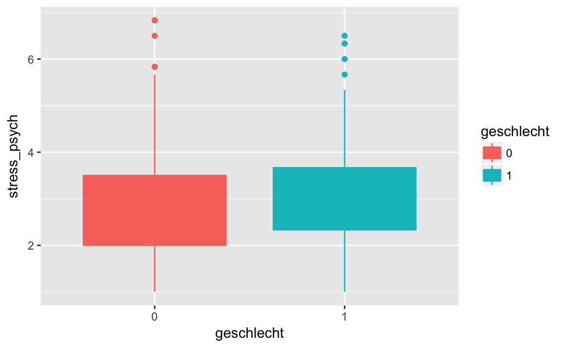
In a box plot, the median is displayed, the rectangle represents the middle 50%, and the whiskers show 1.5 * the interquartile range. Outliers are represented by dots. To actually see the median in the diagram, it is better to omit the fill attribute:
p <- stress_psych %>%
    ggplot(mapping = aes(x = geschlecht,
                         y = stress_psych,
                         color = geschlecht))

p + geom_boxplot()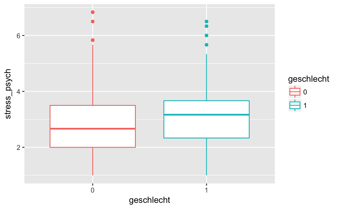
A violin plot is similar to a box plot, but instead of the quantiles it shows a kernel density estimate. A violin plot looks best when we use the fill attribute.
p <- stress_psych %>%
    ggplot(mapping = aes(x = geschlecht,
                         y = stress_psych,
                         fill = geschlecht))
p + geom_violin()
If we find that a mapping should not apply to all “layers” then we can define it individually for each “layer” rather than in the ggplot () function:
p <- stress_psych %>%
    ggplot(mapping = aes(x = geschlecht,
                         y = stress_psych))
p + geom_boxplot(mapping = aes(color = geschlecht))# or simply
p + geom_boxplot(aes(color = geschlecht))
p + geom_violin(aes(fill = geschlecht))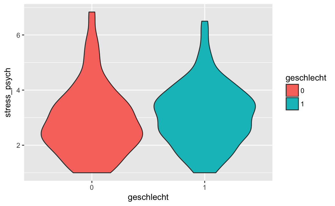
5.3.3 Combining multiple layers
We can also use multiple layers. We just need to combine several geom_ functions with a +:
p +
    geom_violin(aes(fill = geschlecht)) +
    geom_jitter(width = 0.2, alpha = 0.6)

In the previous examples in this script, we did not create a plot object, but rather sent the data frame to the ggplot () function using the pipe operator, and then directly added the geoms with +. In addition, we have used other functions, such as theme_classic() to make the background white.
stress_psych %>%
    ggplot(mapping = aes(x = geschlecht,
                         y = stress_psych,
                         fill = geschlecht)) +
    geom_violin() +
    geom_jitter(width = 0.2, alpha = 0.6) +
    theme_classic()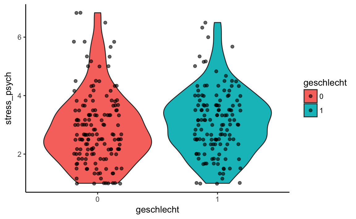
5.4 Geoms for different data types
Let’s summarize: so far we have learned how to put together a plot in several steps. We start with a dataframe and define a ggplot2 object using the ggplot() function. With the aes () function, we assign variables of a dataframe to the X or Y axis and define further “aesthetic mappings”, e.g. a color coding based on a grouping variable. Then we add graphic elements with geom_ * functions as “layers” to the plot object.
Now let’s look at a selection of geoms for different combinations of variables. We can either display one variable on the X axis or two variables on the X and Y axes, and these variables can be either continuous or categorical.
Here we will only consider a small selection of the possible ggplot2 functions. The package is very extensive and has a very good website where everything is documented: ggplot2 Dokumentation
After working through this chapter, you will be able to find graphical visualization solutions yourself. Data visualization can be a very creative process and is fun! Further examples of specific data analysis methods can be found in the following chapters.
For the following examples we use the data sets ‘Beispieldatensatz’ (westost) and ‘Kinderwunsch_Schweiz’ (kinderwunsch):
library(dplyr)
library(tidyr)
library(stringr)
library(haven)
westost <- read_sav("data/Beispieldatensatz.sav")
westost <- westost %>%
mutate(westost = as_factor(westost),
geschlecht = as_factor(geschlecht),
bildung_mutter = as_factor(bildung_mutter,
levels = "values"),
bildung_vater = as_factor(bildung_vater,
levels = "values"),
ID = as.factor(ID))kinderwunsch <- read_sav("data/Kinderwunsch_Schweiz.sav")
kinderwunsch <- kinderwunsch %>%
mutate(geschl = as_factor(geschl))5.4.1 One variable
Even if we want to display only one variable (on the X-axis), we still have to represent some values on the Y-axis. This will often be a descriptive summary such as the frequencies of a categorical variable.
Categorical variable
When we plot a categorical variable, we often use a bar chart or bar graph. This plot represents the frequencies of the different categories based on a rectangle (rectangular bar). The function that is used for this is called geom_bar().
If we do not use fill = ‘lightblue’, color = ‘black’ within the aes() function, then these arguments are not considered a grouping statement. For instance, we can just color all elements light blue with fill = ‘lightblue’.
p <- westost %>%
select(bildung_vater) %>%
drop_na() %>%
ggplot(aes(x = bildung_vater))
p + geom_bar(fill = 'lightblue', color = 'black')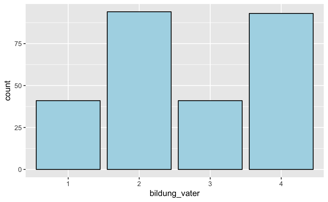
For an overview of the possible color names, use the colors () function. There are 657 colors, of which we are showing here only 15 that are randomly sampled with sample(15):
colors() %>% sample(15)
#> [1] "grey49" "lavender" "rosybrown" "paleturquoise1"
#> [5] "khaki1" "lightsteelblue" "gray50" "forestgreen"
#> [9] "snow2" "gray37" "gray29" "maroon2"
#> [13] "steelblue" "brown" "darkseagreen"Here, too, we can specify a grouping variable, which we use to color code the rectangles.
p <- westost %>%
select(bildung_vater, westost) %>%
drop_na() %>%
ggplot(aes(x = bildung_vater, fill = westost))
p + geom_bar()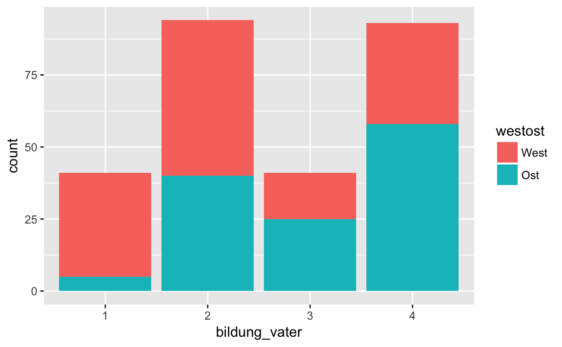
By default, ggplot2 creates a stacked bar chart, i.e. the rectangles are stacked on top of each other. If this is not desired, we can use the argument position = "dodge" of the function geom_bar(). This tells the geom_bar() function that the bars should be drawn next to each other.
p + geom_bar(position = "dodge")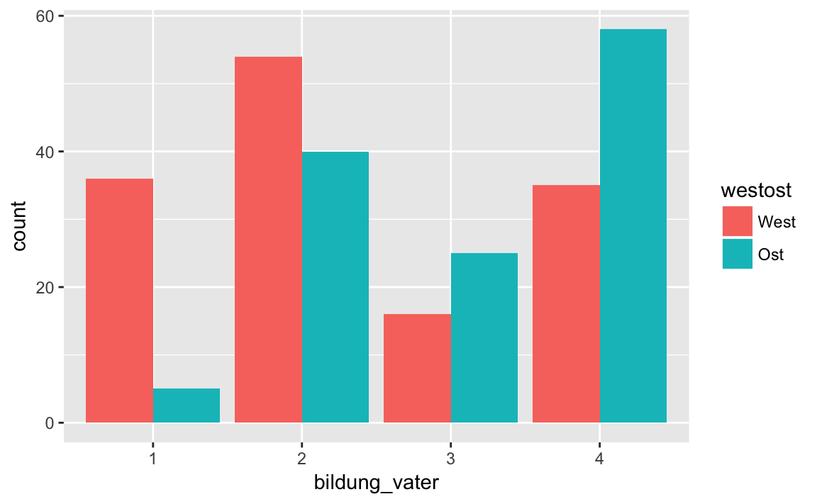
As a third variant we can use position = "identity"; so the bars are drawn on top of each other. Since the rectangle in the background is no longer visible, we use the alpha argument to make the bars transparent.
p + geom_bar(position = "identity", alpha = 0.6)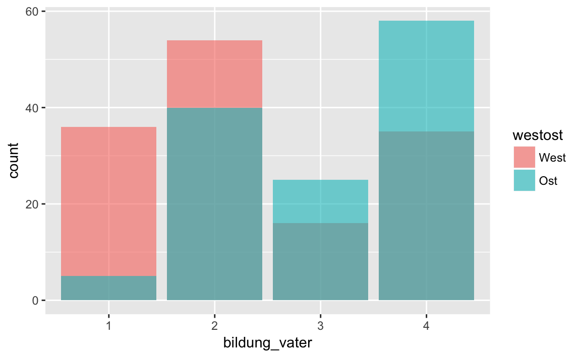
Continous variable
If the variable that we want to represent graphically is not categorical but continuous a histogram is the appropriate option; we generate this with the function geom_histogram (). As an example we consider the psychological stress symptoms.
A histogram provides a graphical representation of the distribution of a numerical variable. For this purpose, the values of these variables are subdivided into discrete intervals, or bins. On the Y-axis, the frequencies in the respective intervals are then displayed, analogous to a bar chart. The determination of the size of the intervals (bin width) is critical. If we do not specify anything, ggplot2 selects a binwidth itself, but we can also specify it ourselves using the binwidth argument.
p <- westost %>%
select(stress_psych) %>%
drop_na() %>%
ggplot(mapping = aes(x = stress_psych))
# automatic bin width selection
p + geom_histogram()
#> `stat_bin()` using `bins = 30`. Pick better value with `binwidth`.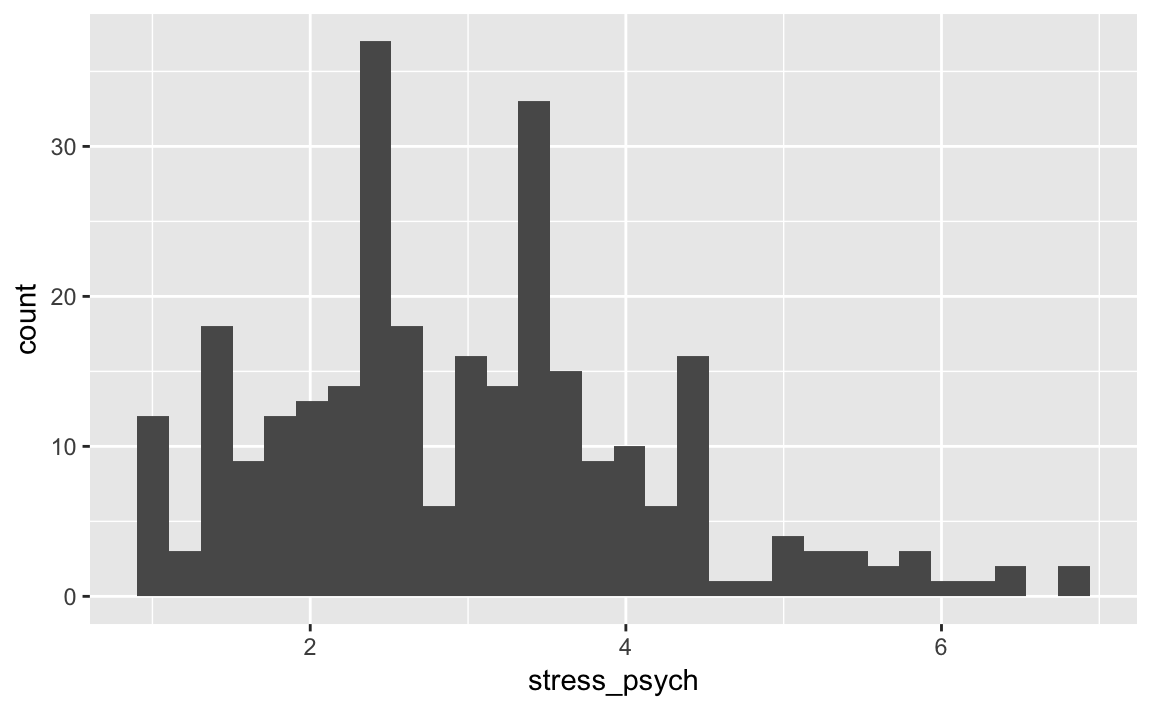
# manual bin width selection
p + geom_histogram(binwidth = 0.5)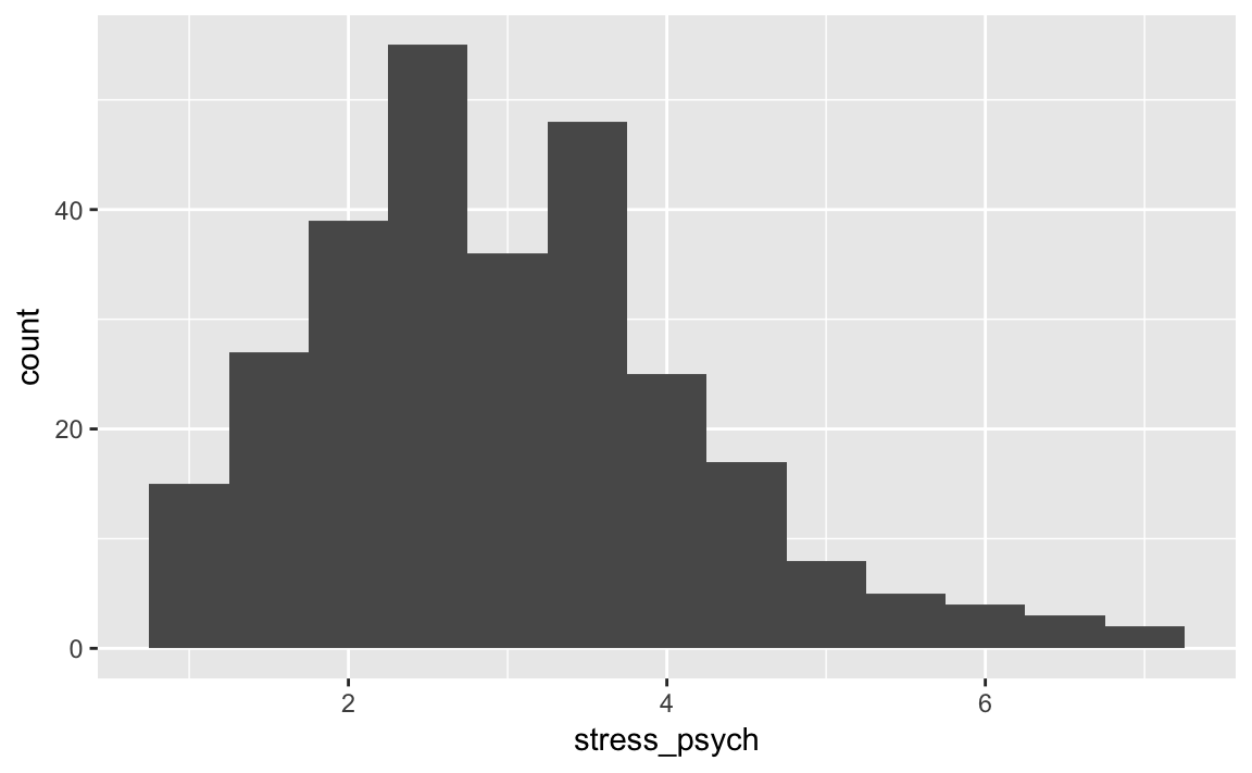
The optimal bin width depends on the scale and variance of the variable and should neither be too fine nor too coarse. Try yourself several values for the bin width.
If we want the relative frequencies on the Y axis instead of the absolute ones, we can use aes() function with the y = ..density.. argument.
p <- westost %>%
select(stress_psych) %>%
drop_na() %>%
ggplot(mapping = aes(x = stress_psych, y = ..density..))
p + geom_histogram(binwidth = 0.5)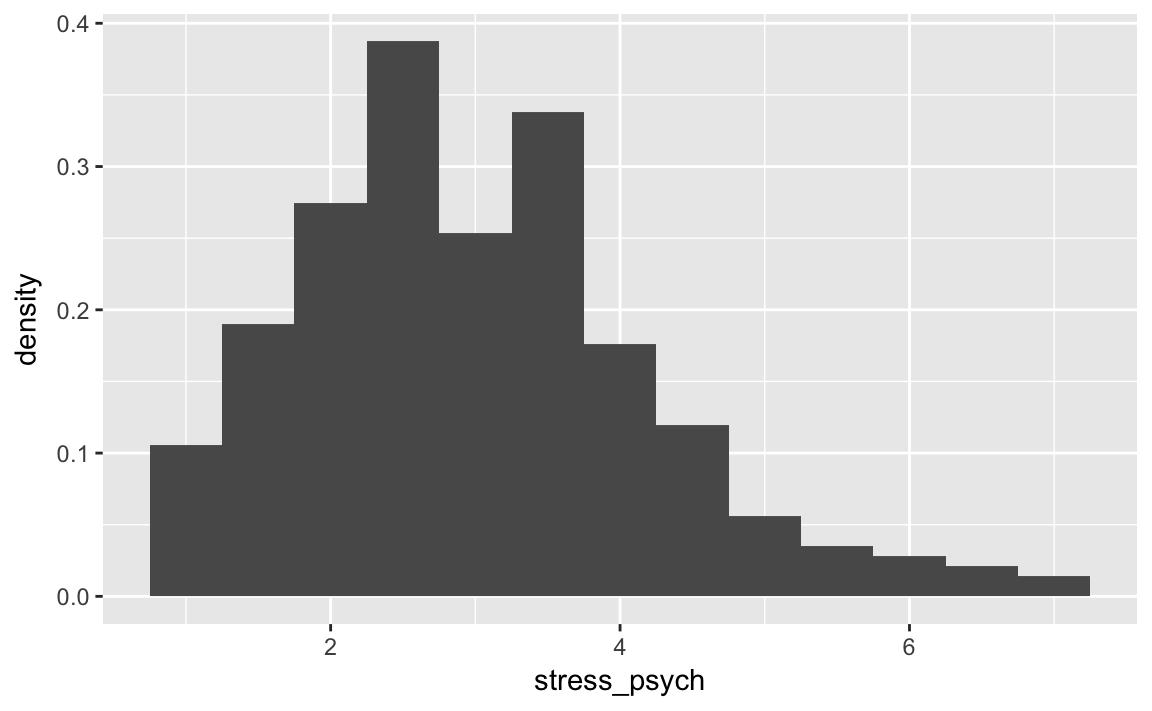
We can use a grouping variable also with histograms:
p <- westost %>%
select(stress_psych, geschlecht) %>%
drop_na() %>%
ggplot(mapping = aes(x = stress_psych, fill = geschlecht))
p + geom_histogram(binwidth = 0.5)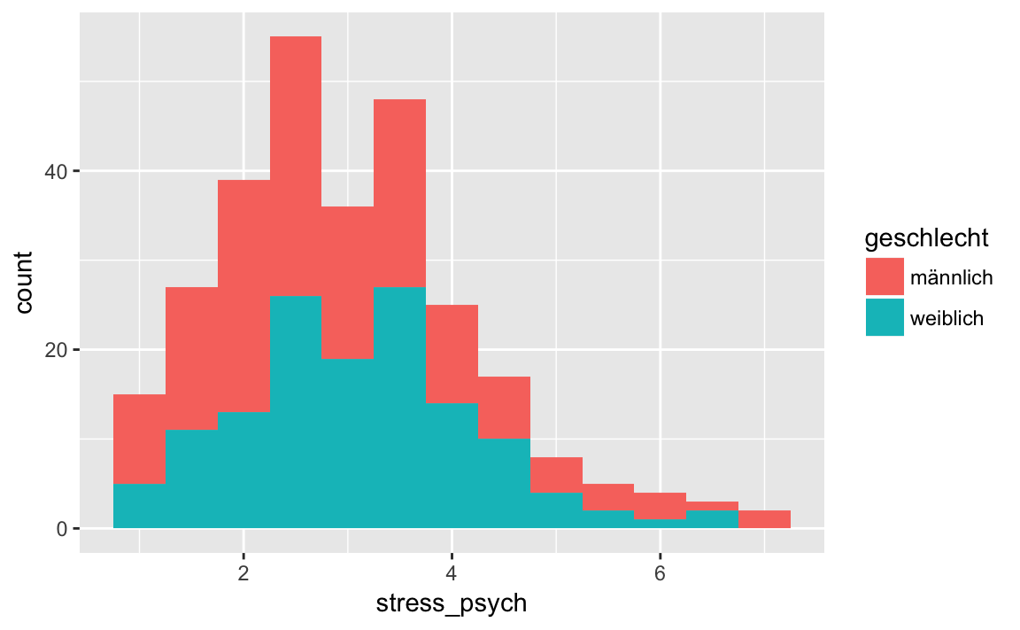
As with the bar chart, the histograms are stacked on top of each other. If we want them separately in the same space of the plot, we use position = "identity" together with the transparancy argument alpha.
p <- westost %>%
select(stress_psych, geschlecht) %>%
drop_na() %>%
ggplot(mapping = aes(x = stress_psych, fill = geschlecht))
p + geom_histogram(binwidth = 0.5,
position = "identity",
alpha = 0.6)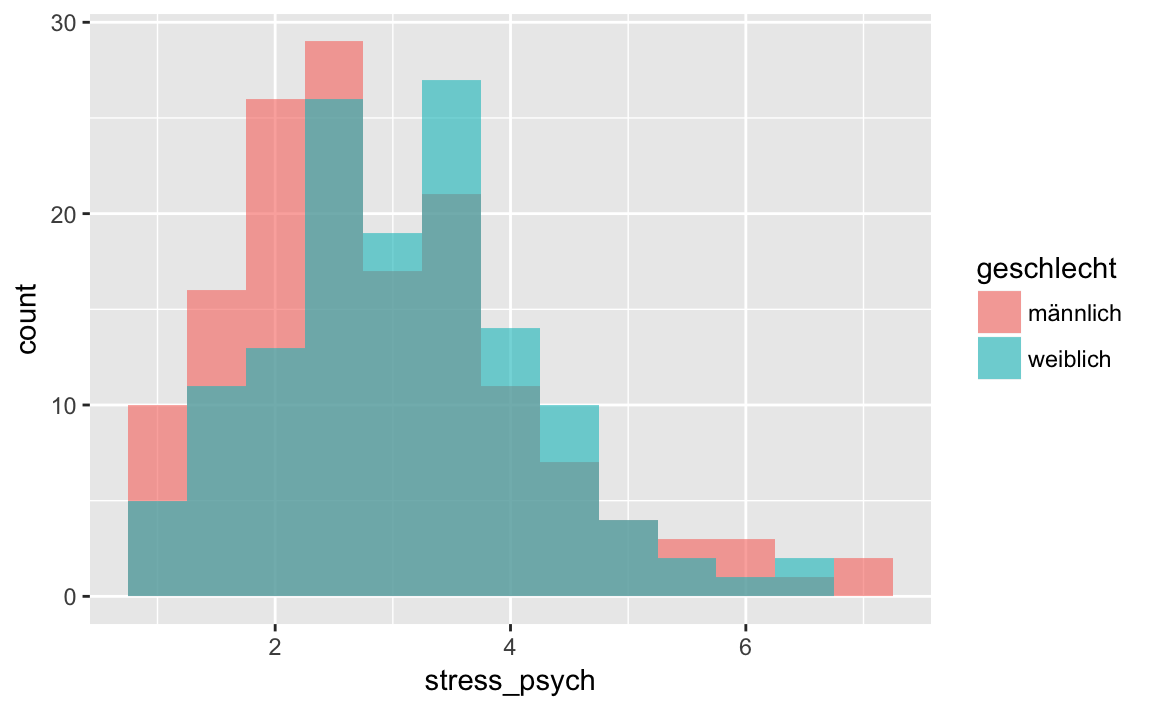
Next to each other is also possible:
p <- westost %>%
select(stress_psych, geschlecht) %>%
drop_na() %>%
ggplot(mapping = aes(x = stress_psych, fill = geschlecht))
p + geom_histogram(binwidth = 0.5,
position = "dodge")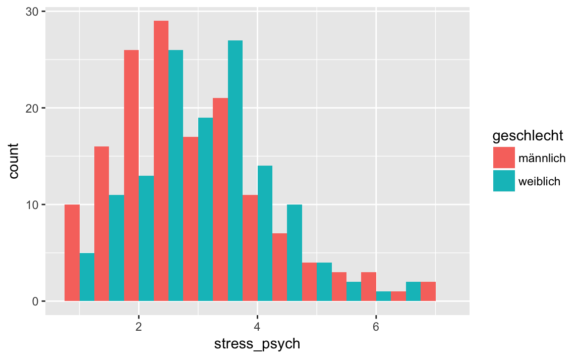
5.4.2 Two variables
Now we display two variables of a data set together. Again, the possible geoms depend on the data type of the variables.
X and Y continuous
If both variables are continuous, we can show their relationship using a scatterplot or a line graph. We use the functions geom_point(), or geom_line().
As an example we want to visualize the relation between psychological stress symptoms and life satisfaction.
p <- westost %>%
select(stress_psych, leben_gesamt) %>%
drop_na() %>%
ggplot(mapping = aes(x = stress_psych, y = leben_gesamt))
p + geom_point(size = 2, alpha = 0.6)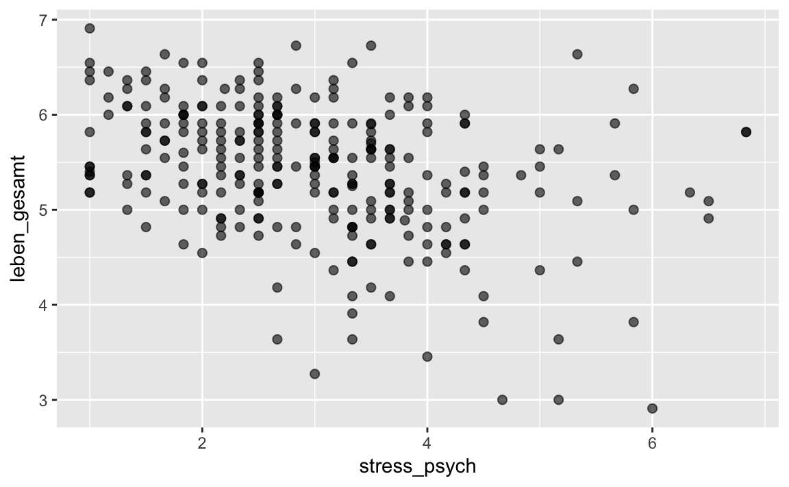 We have already seen the
 size andalpha arguments above, as well as the possibility to avoid ‘overplotting’ with the function geom_jitter(). Both geom_jitter() and geom_point() also have a color argument.
p + geom_jitter(color = "purple")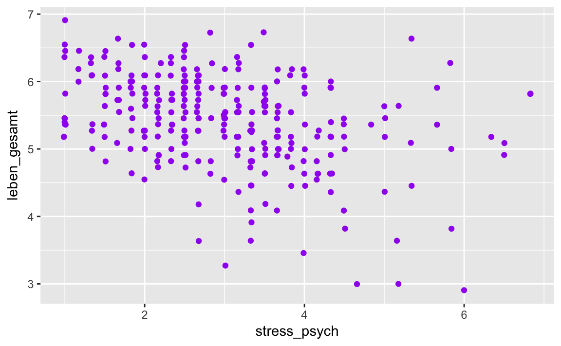
Grouping based on a categorical variable works here as well. We use both the color and the shape of the dots to better distinguish the categories.
p <- westost %>%
select(stress_psych, leben_gesamt, geschlecht) %>%
drop_na() %>%
ggplot(mapping = aes(x = stress_psych,
y = leben_gesamt,
color = geschlecht,
shape = geschlecht))
p + geom_jitter(size = 3, alpha = 0.9)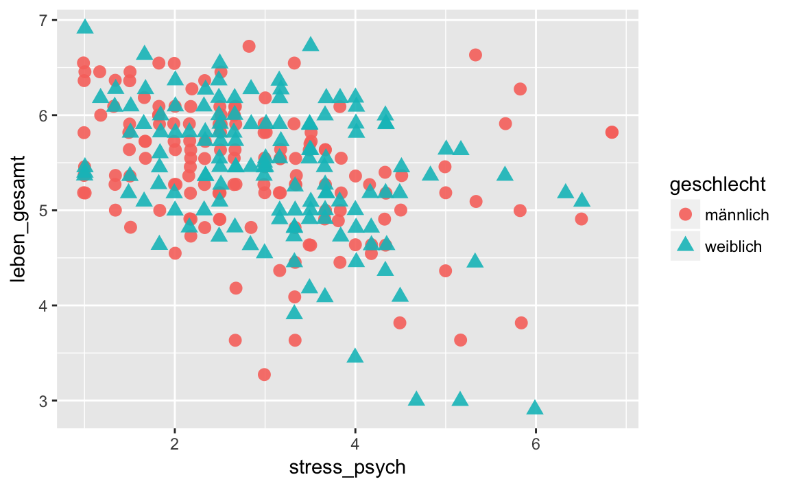
X categorical and Y continuous
If one of the variables is categorical, then instead of using it as a grouping variable, we can represent it on one axis.
We have already seen examples of this: where we presented the variables geschlecht and stress_psych and used the functions geom_boxplot() and geom_violin(). But we can also use the function geom_bar() for two variables. In this case, the variable on the Y axis is summed up for all observations in the categories on the X axis. Since this does not require a statistical transformation, we use the argument stat = 'identity'.
As an example, let’s consider the ‘kinderwunsch’ data set. In this study adolescent subjects were asked if they wanted to have a child or not in the future (binary answer, variable ‘kind_d’). On the Y-axis now the absolute frequencies of a “yes” response shall be represented:
p <- kinderwunsch %>%
ggplot(aes(x = geschl,
y = kind_d,
fill = geschl))
p + geom_bar(stat = 'identity')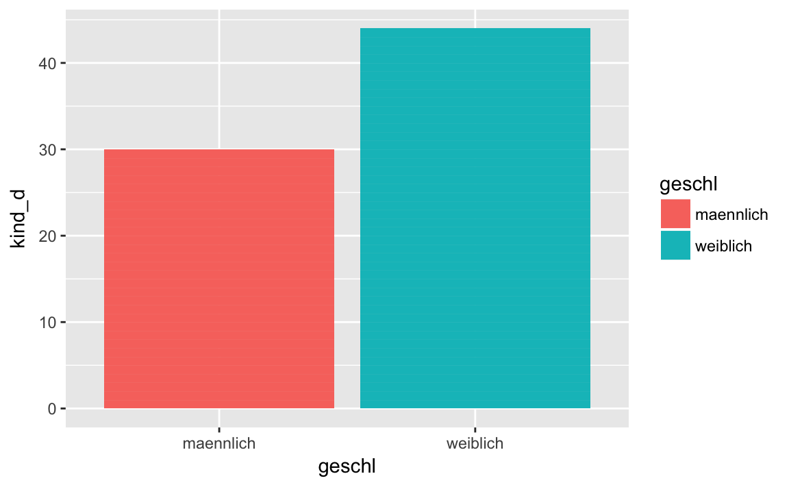
In order to better understand this graph, we additionally calculate the relative frequencies of a “yes” response per gender.
kinderwunsch %>%
group_by(geschl) %>%
summarise(N = length(kind_d),
Ja = sum(kind_d),
prop_Ja = sum(kind_d)/N)
#> # A tibble: 2 x 4
#> geschl N Ja prop_Ja
#> <fct> <int> <dbl> <dbl>
#> 1 maennlich 44 30.0 0.682
#> 2 weiblich 56 44.0 0.786X and Y categorical
Finally, the variables can be categorical on both the X and Y axes. In this case it would be useful to plot the joint frequencies using the function geom_count().
As an example we want to consider the joint frequency distribution of the education of the father and the education of the mother.
p <- westost %>%
select(starts_with("bildung")) %>%
drop_na() %>%
ggplot(aes(x = bildung_vater,
y = bildung_mutter))
p + geom_count()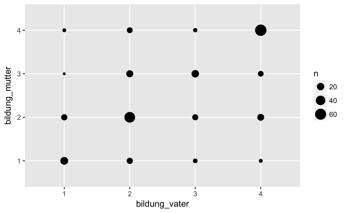
geom_count() counts the common frequencies of the categories of the two variables and displays them as the diameter of the points.
We can obtain the frequency table with the table() function.
table(westost$bildung_vater, westost$bildung_mutter)
#>
#> 1 2 3 4
#> 1 23 12 2 3
#> 2 12 55 17 10
#> 3 5 11 21 4
#> 4 3 16 9 655.4.3 Example
Wide versus Long: Education of Parents
Looking at the next example, let’s look at the difference between long and wide formats. We have used education_father and education_mother as separate variables to represent them on separate axes when we presented the common frequency distribution of father’s and mother’s education. However, we could also summarize education_father and education_mother as levels of a repeated measures factor parents, and the education levels as measurement variable education(value), i.e. as a key/value pair. We do this if we want to use education as a variable on an axis and parents as a grouping variable.
This may not be easy to understand, so let’s look at a concrete example. We want to graphically display the average grade for the different educational levels of the parents. However, we want different lines for father and mother. Now it is important that we have a long dataset.
westost <- read_sav("data/Beispieldatensatz.sav")

westost <- westost %>%
    mutate(westost = as_factor(westost),
           geschlecht = as_factor(geschlecht),
           bildung_mutter = as_factor(bildung_mutter,
                                      levels = "values"),
           bildung_vater = as_factor(bildung_vater,
                                     levels = "values"),
ID = as.factor(ID))bildung <- westost %>%
# choose variables
select(Schnitt, bildung_vater, bildung_mutter) %>%
# remove missing values
drop_na() %>%
# wide to long
gather(key = eltern, value = bildung, -Schnitt) %>%
# convert to factors
mutate(eltern = as.factor(eltern),
bildung = as.factor(bildung)) %>%
mutate(eltern = str_replace(eltern, ".*_", "")) %>%
# grouping: first parents (eltern), then eductional level (bildung)
group_by(eltern, bildung) %>%
# compute grade average
summarise(Schnitt = mean(Schnitt))
bildung
#> # A tibble: 8 x 3
#> # Groups: eltern [?]
#> eltern bildung Schnitt
#> <chr> <fct> <dbl>
#> 1 mutter 1 4.10
#> 2 mutter 2 4.37
#> 3 mutter 3 4.51
#> 4 mutter 4 4.73
#> 5 vater 1 4.08
#> 6 vater 2 4.38
#> # ... with 2 more rowsp <- bildung %>%
ggplot(aes(x = bildung,
y = Schnitt,
colour = eltern,
linetype = eltern,
group = eltern))
p + geom_line(size = 2) +
geom_point(size = 4)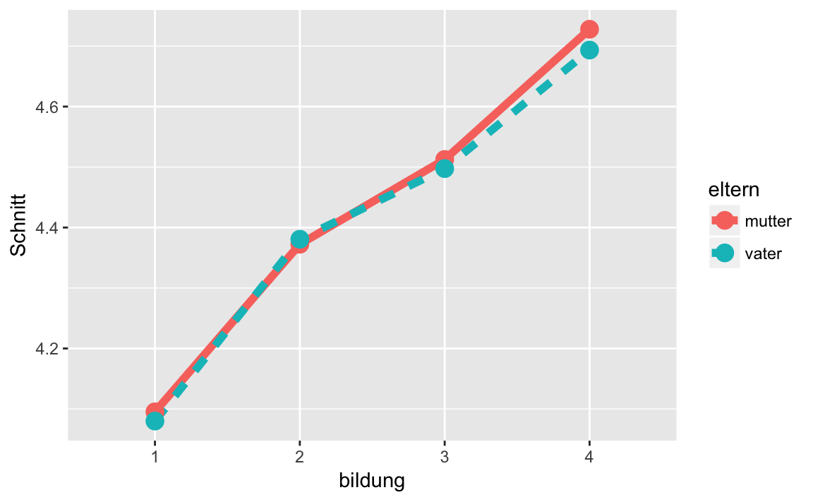
In this example it becomes clear that a big part of working with ggplot2 is getting the data into ‘correct’ format first. When this is done, however, it is relatively easy to create the desired plot.
5.5 Facets
Previously, we used grouping variables to create different colors/shapes/lines for the categories of the grouping variable within a plot. Sometimes this is too confusing.
For example, if we want to create a histogram of grades at each stage of the mother’s education, then the graph would be completely overloaded.
p <- westost %>%
select(Schnitt, bildung_mutter) %>%
drop_na() %>%
ggplot(mapping = aes(x = Schnitt,
fill = bildung_mutter))
p + geom_histogram(binwidth = 0.8,
position = "dodge")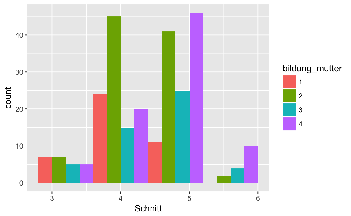
An obvious solution would be to display the histograms for the mother’s education levels in separate graphics.
This is exactly what we can do with the functions facet_wrap() and facet_grid().
With facet_wrap() we create a graphic for each category of the grouping variable:
p <- westost %>%
select(Schnitt, bildung_mutter) %>%
drop_na() %>%
ggplot(mapping = aes(x = Schnitt,
fill = bildung_mutter)) +
facet_wrap(~ bildung_mutter)
p + geom_histogram(binwidth = 0.8)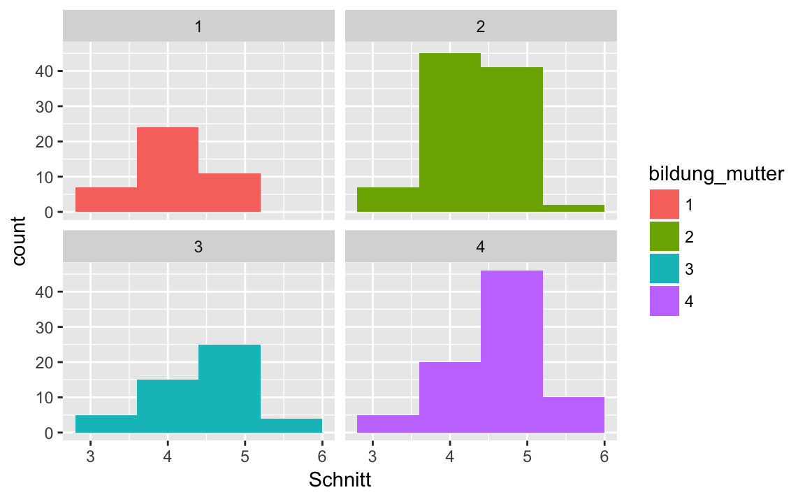
The ~ (tilde) sign here roughly means: ‘depending on’ or ‘as a function of’.
If we have two grouping variables, we can create a raster with facet_grid().
p <- westost %>%
select(Schnitt, bildung_mutter, bildung_vater) %>%
drop_na() %>%
ggplot(mapping = aes(x = Schnitt)) +
facet_grid(bildung_mutter ~ bildung_vater)
p + geom_histogram(binwidth = 0.8,
fill = 'steelblue4')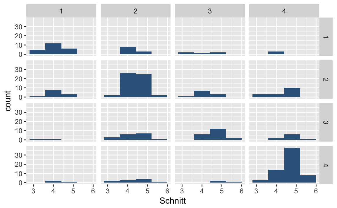 Here the levels of
 education_mother are shown in the rows, and the levels of education_vater in the columns.
As a second example we can plot the grade average as a line diagram, depending on the parents’ education, separated into plots for fathers and mothers. From this example, we see that we can use facet_grid () even if we only have one grouping variable, to set the number of rows or columns.
If we want the grouping in the rows, we write facet_grid(grouping variable ~.), if we want it in the columns, we’ll write facet_grid(. ~ grouping variable). The point . here means that we do not use grouping variables for the rows or columns, respectively.
p <- bildung %>%
ggplot(aes(x = bildung,
y = Schnitt,
group = eltern))
p + geom_line(size = 2, color = 'pink') +
geom_point(size = 4, color = 'steelblue3') +
# Stufen von 'eltern' in die Zeilen
facet_grid(eltern ~ .)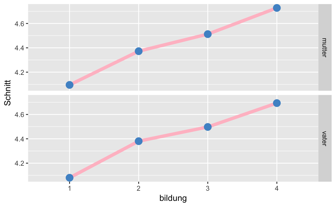
p <- bildung %>%
ggplot(aes(x = bildung,
y = Schnitt,
group = eltern))
p + geom_line(size = 2, color = 'pink') +
geom_point(size = 4, color = 'steelblue3') +
# Stufen von 'eltern' in die Spalten
facet_grid(. ~ eltern)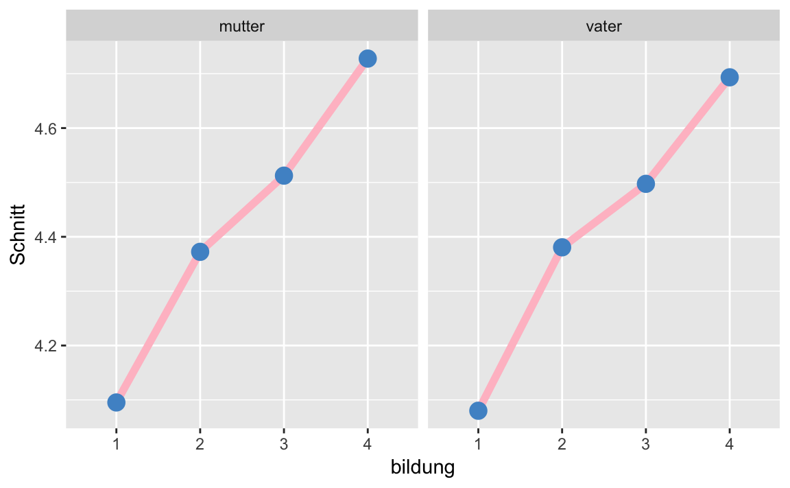
5.6 Colors and themes
So far, ggplot2 has automatically chosen colors for us when we asked for colors for a grouping. However, the standard color palette is extremely poor for color blind people. There are many color palettes that we could use.
We will define here our own palette, which is suitable for color blind peole.
palette <- c("#000000", "#E69F00",
"#56B4E9", "#009E73",
"#F0E442", "#0072B2",
"#D55E00", "#CC79A7")We thus define a vector of eight Hex Codes. As a consequence, our grouping variable should not have more than eight categories.
We will use the palette as follows:
- to fill in shapes we use
scale_fill_manual(values = palette)- for lines and dots we use
scale_colour_manual(values = palette)As an example, we again plot the relationship between stress_psych andleben_gesamt, this time with our own color palette.
p <- westost %>%
    select(stress_psych, leben_gesamt, geschlecht) %>%
    drop_na() %>%
    ggplot(mapping = aes(x = stress_psych,
                         y = leben_gesamt,
                         color = geschlecht,
                         shape = geschlecht))

p + geom_jitter(size = 3, alpha = 0.9) +
scale_colour_manual(values = palette)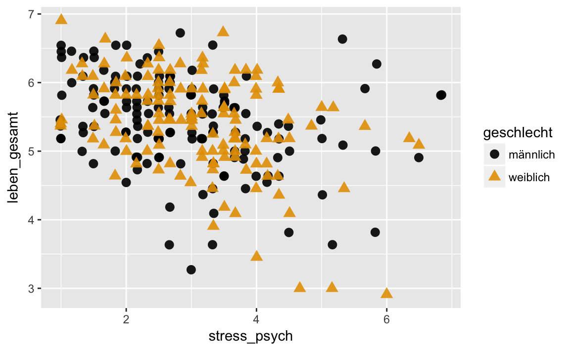
We can assign the colors also ‘manually’:
p + geom_jitter(size = 3, alpha = 0.9) +
scale_colour_manual(values = c("pink2", "steelblue3"))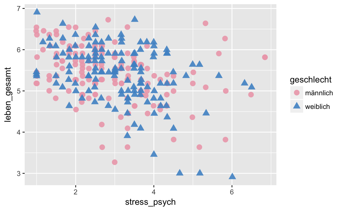
Another tricky point is the gray background that ggplot2 automatically chooses. The easiest way to change this is to define a ‘theme’. There are two such ‘themes’ that have a white background: theme_bw() and theme_classic(). These two in turn differ in that theme_classic() does not draw ‘gridlines’, and only the left and bottom axes.
p <- westost %>%
    select(stress_psych, leben_gesamt, geschlecht) %>%
    drop_na() %>%
    ggplot(mapping = aes(x = stress_psych,
                         y = leben_gesamt,
                         color = geschlecht,
                         shape = geschlecht))

p + geom_jitter(size = 3, alpha = 0.9) +
scale_colour_manual(values = palette) +
theme_bw()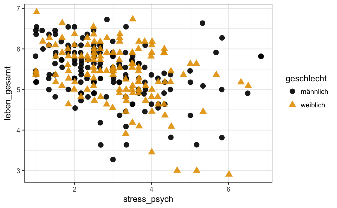
p <- westost %>%
    select(stress_psych, leben_gesamt, geschlecht) %>%
    drop_na() %>%
    ggplot(mapping = aes(x = stress_psych,
                         y = leben_gesamt,
                         color = geschlecht,
                         shape = geschlecht))

p + geom_jitter(size = 3, alpha = 0.9) +
    scale_colour_manual(values = palette) +
    theme_classic()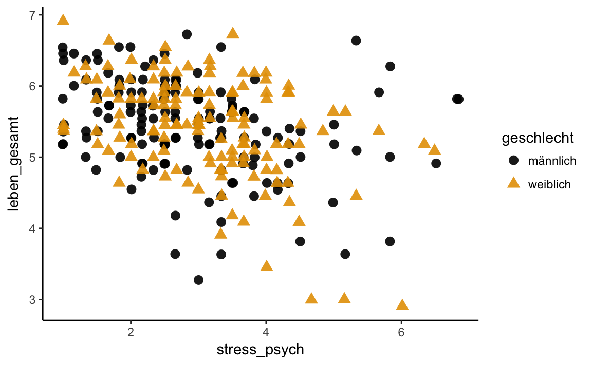
5.7 Captions
Now we can also change the labels of the X / Y axes with xlab() and ylab(), and give the plot a title with the ggtitle() function. With the function labs() we can additionally change the title of the legend.
Finally, we also want to change the font size, as the standard size often seems too small. We do this with the argument base_size = FONT SIZE of the theme_* functions.
p <- westost %>%
    select(stress_psych, leben_gesamt, geschlecht) %>%
    drop_na() %>%
    ggplot(mapping = aes(x = stress_psych,
                         y = leben_gesamt,
                         color = geschlecht,
                         shape = geschlecht))

p + geom_jitter(size = 3, alpha = 0.9) +
    scale_colour_manual(values = palette) +
    theme_classic(base_size = 14) +
    ggtitle("Zufriedenheit vs. Stress") +
    xlab("Psych. Stress")+
    ylab("Zufriedenheit") +
    # Titel der color-Legende und der shape-Legende ist "Geschlecht"
    labs(color = "Geschlecht",
         shape = "Geschlecht")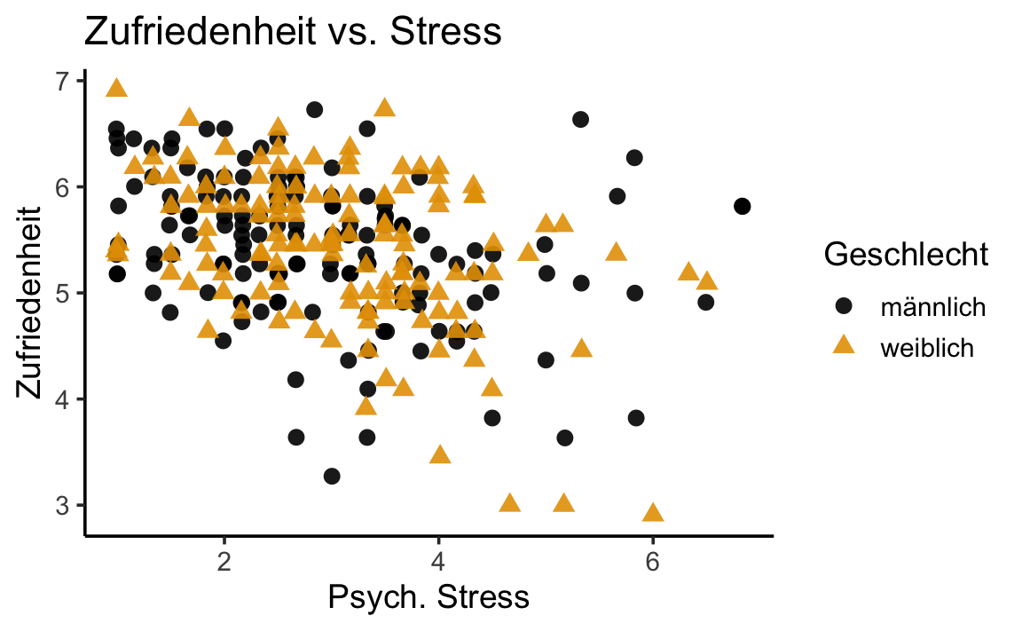
5.8 Save plots
Of course, if we made a nice graph or plot, we want to save it. We can do this with the function ggsave(). The function takes as arguments the file name, the name of the plot object and other properties, such as the desired height and width of the plot. These may expressed in “cm” using the argument units = "cm". To save the graph, we must have assigned our finished ggplot2 object to a variable:
p <- westost %>%
    select(stress_psych, leben_gesamt, geschlecht) %>%
    drop_na() %>%
    ggplot(mapping = aes(x = stress_psych,
                         y = leben_gesamt,
                         color = geschlecht,
                         shape = geschlecht))

# Wir nennen die Grafik 'my_plot'
my_plot <- p + geom_jitter(size = 3, alpha = 0.9) +
    scale_colour_manual(values = palette) +
    theme_classic(base_size = 14) +
    ggtitle("Zufriedenheit vs. Stress") +
    xlab("Psych. Stress")+
    ylab("Zufriedenheit") +
    # Titel der color-Legende ist "Geschlecht"
    labs(color = "Geschlecht") +
    # Legende für shape weglassen
    guides(shape = FALSE)
my_plot can now be saved:
ggsave(filename = "my_plot.png",
       plot = my_plot)
#> Saving 6 x 3.71 in image
5.9 Exercise
In this exercise we want to examine the six self-efficacy scales in the ‘westost’ data set. We assume that these are related to the overall grade average. Before we calculate a multiple regression, let’s try to plot the relationships between these variables.
selbstwirksamkeit_wide <- westost %>%
    select(ID, Schnitt, starts_with("swk_")) %>%
    drop_na()

selbstwirksamkeit_wide
#> # A tibble: 279 x 8
#>   ID    Schnitt swk_akad swk_selbstreg swk_durch swk_motselbst swk_sozharm
#>   <fct>   <dbl>    <dbl>         <dbl>     <dbl>         <dbl>       <dbl>
#> 1 2           4     5             4         5              4.6        5.57
#> 2 14          4     4.86          4.5       5.33           4.6        4.71
#> 3 15          4     4             4.38      4.33           5.6        4.43
#> 4 17          4     6.14          5.62      6              6          6
#> 5 18          4     5.14          4.62      4.33           4.4        4.14
#> 6 19          4     5.43          4.62      6.33           5.2        6.29
#> # … with 273 more rows, and 1 more variable: swk_bez <dbl>
Try to discover relationships between the six self-efficacy scales by plotting them. For example, try to create a scatterplot for each pair of variables.
p <- selbstwirksamkeit_wide %>%
    ggplot()
p + geom_jitter(aes(x = swk_akad, y = swk_durch), alpha = 0.6, size = 2)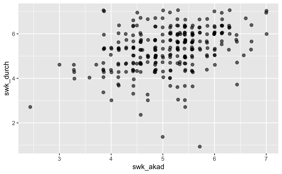
p + geom_jitter(aes(x = swk_akad, y = swk_motselbst), alpha = 0.6, size = 2)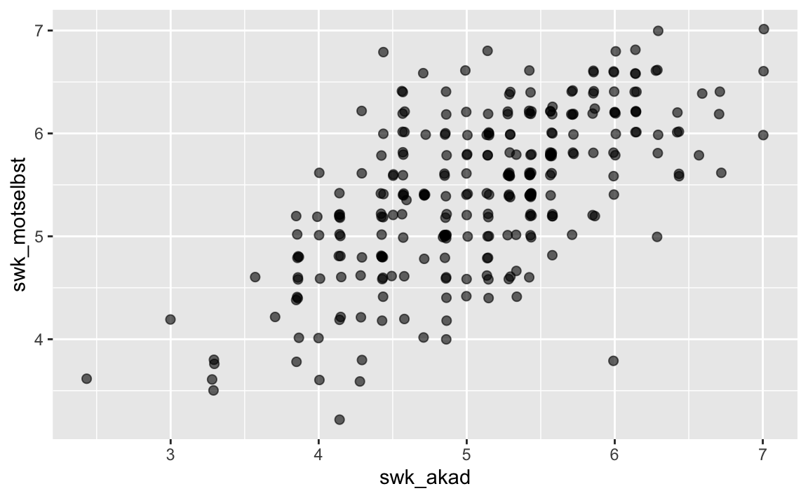
There are several ways to create graphics in R. With the original graphics system (R Base Graphics) we can quickly create simple graphics. It is also very powerful and flexible, but the problem is that the syntax looks a bit archaic, and it is difficult for beginners to customize graphics.